Showing posts with label FreeHand Tutorial. Show all posts

Tuesday, February 22, 2011

Macromedia Freehand 9 Shortcut Keys

List of shortcut keys
Shortcut Command How useful(?)
File

Macromedia Freehand 9

Cmd+N New +       –
Cmd+O Open +       –
Cmd+W Close +       –
Cmd+S Save +       –
Cmd+Shft+S Save As +       –
Cmd+R Import +       –
Cmd+Shft+R Export +       –
Cmd+P Print +       –
Cmd+Shft+D Preferences +       –
Cmd+Q Quit +       –

Edit

Macromedia Freehand 9

F1, Cmd+Z Undo +       –
Cmd+Y Redo +       –
F2, Cmd+X Cut +       –
F3, Cmd+C Copy +       –
F4, Cmd+V Paste +       –
Cmd+Shft+X Cut Contents +       –
Cmd+Shft+V Paste Inside +       –
Cmd+Shft+Opt+C Copy Attributes +       –
Cmd+Shft+Opt+V Paste Attributes +       –
Cmd+D Duplicate +       –
Cmd+= Clone +       –
Cmd+A Select All +       –
Cmd+Shft+A Select All In Document +       –
Cmd+Shft+F Find & Replace Text +       –
Cmd+Opt+E Find & Replace Graphics +       –

View

Macromedia Freehand 9

Cmd+0 Fit Selection +       –
Cmd+Shft+W Fit To Page +       –
Cmd+Opt+0 Fit All +       –
Cmd+5 50% magnification +       –
Cmd+1 100% magnification +       –
Cmd+2 200% magnification +       –
Cmd+4 400% magnification +       –
Cmd+8 800% magnification +       –
Cmd+Opt+1 Previous custom view +       –
Cmd+K Preview +       –
Cmd+Shft+K Fast Mode +       –
Cmd+Shft+Opt+G Flash Anti-alias +       –
Cmd+Opt+T Toolbars +       –
F12, Cmd+Shft+H Panels +       –
Cmd+Opt+M Page Rulers +       –
Cmd+/ Text Rulers +       –
Cmd+' Snap To Point +       –
Cmd+\ Snap To Guides +       –
Cmd+; Snap To Grid +       –

Modify

Macromedia Freehand 9

Cmd+I Object Inspector +       –
Cmd+Opt+L Stroke Inspector +       –
Cmd+Opt+F Fill Inspector +       –
Cmd+T Text Inspector +       –
Cmd+Opt+D Document Inspector +       –
Cmd+F10 Transform Scale +       –
Cmd+E Transform Move +       –
Cmd+F13 Transform Rotate +       –
Cmd+F9 Transform Reflect +       –
Cmd+F11 Transform Skew +       –
Cmd+, Transform Again +       –
Cmd+F Bring To Front +       –
Cmd+[ Move Forward +       –
Cmd+] Move Backward +       –
Cmd+B Send To Back +       –
Cmd+Shft+Opt+A Align Again +       –
Cmd+J Join +       –
Cmd+Shft+J Split +       –
Cmd+Shft+B Blend +       –
Cmd+Shft+Opt+B Join Blend To Path +       –
Cmd+Shft+Opt+Z Rasterize +       –
Cmd+L Lock +       –
Cmd+Shft+L Unlock +       –
Cmd+G Group +       –
Cmd+U Ungroup +       –

Text

Macromedia Freehand 9

Cmd+Shft+< Size->Smaller +       –
Cmd+Shft+> Size->Larger +       –
F5, Cmd+Shft+Opt+P Style->Plain +       –
F6, Cmd+Opt+B Style->Bold +       –
F7, Cmd+Opt+I Style->Italic +       –
F8, Cmd+Shft+Opt+O Style->Bold Italic +       –
Cmd+Shft+Opt+H Highlight +       –
Cmd+Shft+Opt+S Strikethrough +       –
Cmd+Shft+Opt+U Underline +       –
Cmd+Shft+Opt+L Align->Left +       –
Cmd+Shft+Opt+R Align->Right +       –
Cmd+Shft+Opt+M Align->Center +       –
Cmd+Shft+Opt+J Align->Justified +       –
Cmd+Shft+M Em Space +       –
Cmd+Shft+N En Space +       –
Cmd+Shft+T Thin Space +       –
Cmd+- Discretionary Hyphen +       –
Cmd+Shft+E Text Editor +       –
Cmd+Shft+G Spelling +       –
Cmd+Opt+W Run Around Selection +       –
Cmd+Shft+U Flow Inside Path +       –
Cmd+Shft+Y Attach To Path +       –
Cmd+Shft+P Convert To Paths +       –

Xtras

Macromedia Freehand 9

Cmd++ Repeat Last Xtra +       –

Window

Macromedia Freehand 9

Cmd+Opt+N New Window +       –
Cmd+Opt+T Text Toolbars +       –
Cmd+7 Toolbox +       –
Cmd+I Object Inspector +       –
Cmd+Opt+L Stroke Inspector +       –
Cmd+Opt+F Fill Inspector +       –
Cmd+T Text Inspectors +       –
Cmd+Opt+D Document Inspector +       –
Cmd+6 Layers Panel +       –
Cmd+3 Styles Panel +       –
Cmd+9 Color List +       –
Cmd+Shft+C Color Mixer +       –
Cmd+Shft+Z Tints Panel +       –
Cmd+H Halftones Panel +       –
Cmd+Opt+A Align Panel +       –
Cmd+M Transform Panel +       –

Other

Macromedia Freehand 9

Cmd+Page Up Previous Page +       –
Cmd+Page Down Next Page +       –
Cmd+T Character Inspector +       –
Cmd+Opt+P Paragraph Inspector +       –
Cmd+Opt+K Spacing Inspector +       –
Cmd+Opt+R Columns & Rows Inspector +       –
Cmd+Opt+C Adjust Columns Inspector +       –

Text

Macromedia Freehand 9

Cmd+Num + Increase Leading +       –
Cmd+Num - Decrease Leading +       –
Cmd+Opt+Right Increase Kerning 1% +       –
Cmd+Opt+Left Decrease Kerning 1% +       –
Cmd+Shft+Opt+Right Increase Kerning 10% +       –
Cmd+Shft+Opt+Left Decrease Kerning 10% +       –
Cmd+Opt+Up Increase Baseline Shift +       –
Cmd+Opt+Down Decrease Baseline Shift +       –

Alignment

Macromedia Freehand 9

Cmd+Opt+8 Top +       –
Cmd+Opt+6 Right +       –
Cmd+Opt+7 Center Horizontal +       –
Cmd+Opt+9 Center Vertical +       –
Cmd+Opt+5 Bottom +       –
Cmd+Opt+4 Left +       –

Stroke

Macromedia Freehand 9

Cmd+Opt+Shft+< Thinner +       –
Cmd+Opt+Shft+> Thicker +       –

Toolbox

Macromedia Freehand 9

Shft+F10, V Select +       –
Shft+F9, A, T Text +       –
Shft+F1, 1, R Rectangle +       –
Shft+F8, 2, G Polygon +       –
Shft+F3, 3, E Ellipse +       –
Shft+F4, 4, N Line +       –
Shft+F5, 5, Y Freehand +       –
Shft+F6, 6, P Pen +       –
Shft+F7, 7, K Knife +       –
Shft+F2, 8, B Bezigon +       –
F13 Rotate +       –

Creating “Hollow” Envelopes

Using custom Envelopes to mimic a brush stroke
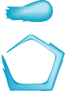
Ever since FreeHand's competition featured custom Brushes, FreeHand users were feeling a bit left out. Well with this tip, not only will you be able to create brush type effects like shown above at right, you'll also be learning how to create a very unique Envelope that you can use for other effects.
I'm not even sure what to call this kind of envelope (Hollow?), but what it will be doing is warping the art to look like it's going "around" the shape instead of being warped inside. The process can be time consuming and sometimes confusing, but the results are amazing. Special thanks to Ranko Tomic for helping me out with this. Based on original envelopes sent to me by Jose Israel Rivas.
Note: You can now create Brushes in FreeHand 10. You may download the file at the end of this tip to use the objects as Graphic Symbols, then apply them as a Brush in FreeHand 10

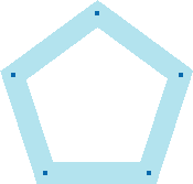
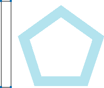
1) We're going to start off with a fairly simple shape to just show you the concept. Basically a starting point for you to take and make your very own envelopes later. Draw a Pentagon shape like shown above using the Polygon tool. Give the stroke about a 20 pt. width and apply a lightly tinted color to it.
This represents the thickness of the final envelope. If you want to try something thicker or thinner, adjust the stroke width.
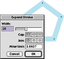
2) While the shape is selected, go under the Modify menu -> Alter Path -> Expand Stroke, or hit the toolbar button. Enter in the width of the stroke if it's not already there, here we use 20.
3) Now either Lock this shape or put it on a separate layer under the Foreground layer and lock that layer. This will be used as a guide for the Hollow Envelope we are about to create.
4) Next, draw a rectangle about as tall as the shape and Ungroup it. Now we'll be adding some extra points to this rectangle to use later, but first we need to find out how many points to add.
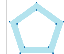
5) If we go back to the pentagon shape and select the paths, we can see that it contains 10 points total. So we take take that value and add 2 more points for a total of 12 points. This is the amount of points we want to have in the rectangle to work with.
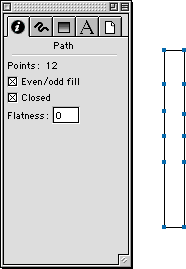
6) Use either the Bezigon or Pen tools to add the points to the longest sides of the rectangle until you see in the Object Inspector, that it has 12 points. It is very important to add the same number of points to either side of the rectangle like shown above.
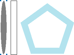
7) Next draw any shape about as tall as the rectangle. Above I just drew a thin Ellipse. This is what we'll be applying the envelope to temporarily. To get you through the next steps, it may be helpful to give this ellipse a Lens fill so that it's semitransparent.
Now select the rectangle we created, and Cut or Copy it into the clipboard.
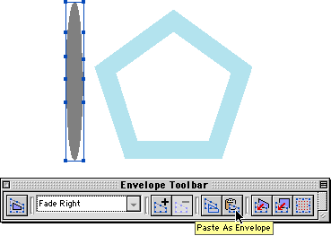
8) Select the Ellipse and in the Envelope Toolbar, hit the Paste as Envelope button to apply the new envelope. Now we're ready to get started, but first I'm going to try to explain the next steps, and I hope it's not too confusing for you.
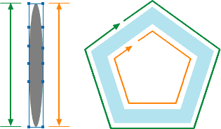
What you'll be doing is moving the points of the Envelope to correspond with the points of the pentagon shape. The points highlighted in Green will be snapped to the outside points of the pentagon, while the ones highlighted in Orange will be snapped to the inside.
Got it? I certainly hope so... heh heh.
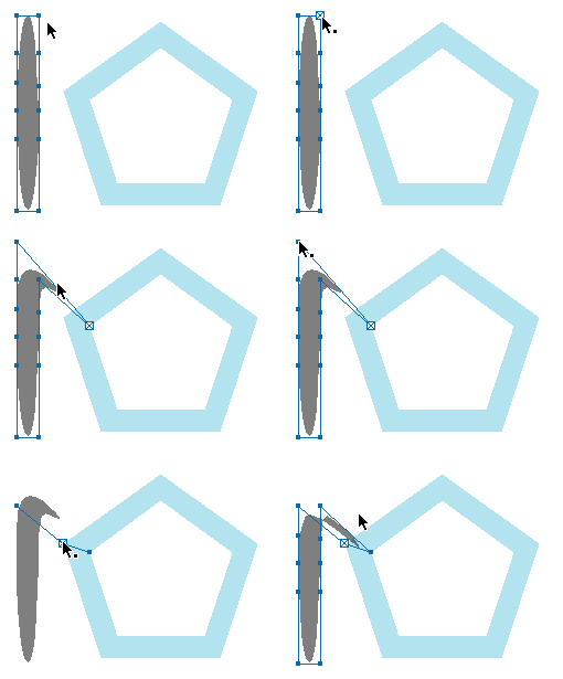
9) First turn on Snap to Points under the View menu if it isn't already. Start with the top two points of the Envelope and snap them to their corresponding points on the polygon. You can pick any points to start from on the polygon. Look at the animation above to see it in action.
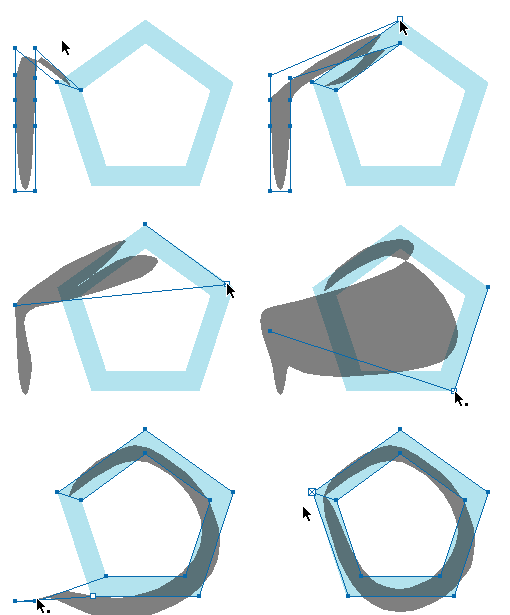
10) Now continue the process with the remaining points. Making sure that the inside points of the envelope snap to the inside points of the polygon shape and the outside points of the envelope snap to the outside of the polygon. Watch the animation above to see me finish off my envelope. Yes it can get pretty confusing at first, but it definitely helps if you've used a Lens filled shape so you can see the underlying polygon points.
When you get to the bottom points of the envelope, just snap them to the original top points where you started.
When you are finished, it's safe to hide or remove the original polygon.
Special Note
For shapes with curves in them, first place all the envelope points where they should go. Click on the point first, then press and hold the Option (Alt) key. Then just click-drag curve handles from the envelope points to match the curve underneath like shown in the animation at left.
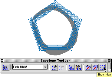
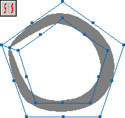
To test and see if the Envelope was created correctly, hit the Show Map button on the Envelope Toolbar. You should see that the Envelope is warping around the inside of the polygon shape like shown above.
11) Now it's time to finish and add this to FreeHand as an Envelope preset. While the envelope is still selected, go under the Xtras menu -> Distort -> Add Points or use the toolbar button shown above.
This adds more points to the Envelope and you'll immediately notice that it warps the shape much more accurately. You can add as many points as you feel necessary for your envelopes.
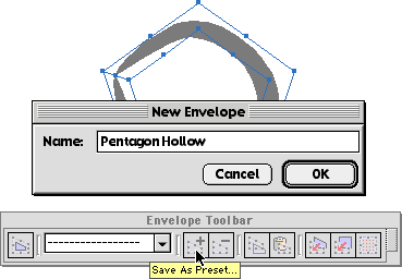
12) Once you've added points to the Envelope and are happy with it's appearance, keep it selected and hit the Save as Preset button. Then name it. Congratulations! You have now created a Hollow Envelope and it's been saved in FreeHand ready to be reused.
Now apply it to something more interesting. Above I created a neat looking brush stroke that is actually a blend of two shapes. Once the Envelope is applied, you'll notice that it may be squashed, so just use the Transform Handles to adjust this. Once finished, it definitely has the appearance of a natural brush stroke!
Special Note
Sometimes it may be necessary to add points to the shapes before applying the Envelope to them to get more accurate results. Just select the shape and go under the Xtras menu -> Distort -> Add Points or use the toolbar button.
Now that you have the concept down, go ahead and make other unique "Hollow" Envelopes like shown above. Again, depending on the complexity of the shape you want to make, it could be very time consuming and confusing. But, once you're finished, just save it as a preset and it will be available to you in any FreeHand document.
Or just download the sample file below, and snatch up these envelopes already made for you.

Creating the Colors, Layers and Styles

First we are going to setup a document with all the necessary elements for the effect. Make sure your document measurement is set to Points.
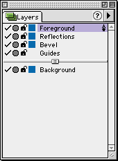
In a new document, create some new layers named Reflections and Bevel. Put them in the order that you see above.
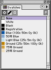
Then you will need to make some new colors in the Color list (or Swatches). Above are the CMYK mixtures to use for the base colors (Blue, Light Blue, Ground). Then create a 50% Tint of the Blue. Also create 75% and 25%Tints of the Ground color.
Now we will be creating a bunch of new Styles to use for the various objects we'll be creating. Below are the names of the Styles and the colors to use in the Gradient fills, as well as the angle of the fill.
To quickly create new Styles, draw a rectangle (with no stroke) for each fill as described below. Then select the rectangle and in the Style palette pull-down menu, choose New. This will create a new Style based on your selection. Name it and continue with the remaining fill Styles.
Sky to Ground Gradient fill
Blue -> 25% Ground
270°
Ground to Sky Gradient fill
25% Ground -> Blue
270°
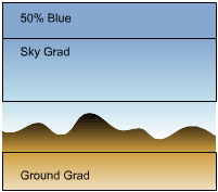
Ground Grad Gradient fill
75% Ground ->
25% Ground
270°
Horizon Gradient fill
Black -> 75% Ground
270°
Sky Grad Gradient fill
50% Blue -> Light Blue
270°
Sky to White Gradient fill
Light Blue -> White
270°
There, now we have all the assets for the rest of the tutorial. This may seem like a lot of things to worry about, but believe me, it all comes together later.

Building the object bevels
The next series of steps are pretty lengthy so it may be easier for you to print this tutorial out while you are working on it. Just click in this frame and use the Print command.
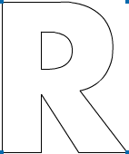
1) Click on the Bevel layer to activate it. Then type a large letter to start with. For this tutorial it's best to use a fat sans serif font. I used Futura Bold at 200 points. Throughout this tutorial, you may see me use different letters to show different circumstances you may come across for other letters you use in the future. Convert this letter to paths, and set the Fill to None and give it a Black Stroke.
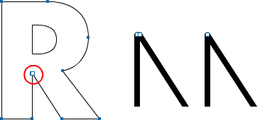
2) Now you'll want to delete some extra points that may be in the letter. Some corner areas may have two points like shown above in the zoomed area. Just remove one of the points since it will be easier to create the bevels later. If the letter is joined as a composite path, you can select points by holding the Option(Alt) key as you click.
3) Next, Clone the whole letter and put the clone on the Reflections layer. Hide the Reflections layer for now. Select the letter on the Bevel layer and Clone it one more time.
WOW, a lot of clones huh? Well I hope that wasn't too confusing for you. Here's a recap. You should have one clone on the Reflections layer, and two clones on the Bevel layer. Ready to continue? Here we go...
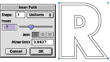
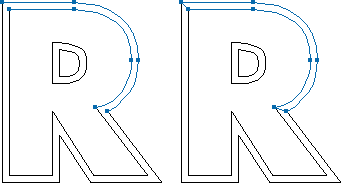
4) Select the top clone elements and bring up the Inset Path dialog by either using the Toolbar icon or going under the Modify menu -> Alter Path. In this dialog, enter 1 for the Steps and use -7 for the Inset amount. Make sure that the Join option is set at squared. You can modify the Inset amount to make the bevel either thinner or thicker.
When you hit OK, you should see the clone expand like shown above.
If your letter has knockouts like shown above, then Split both clones under the Modify menu.
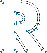
5) Now Shift-select only the Corner points of the paths like shown above. Ignore any points that appear on the curves. While the points are selected, Split them under the Modify menu.
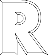
6) Next it's time to join all of the bevel parts together. Select the corresponding paths from the inner and outer shapes. Then Join them together. Go into the Object Inspector palette and click the Closed option. Repeat this for all of the paths in your letter. To check to see if you've joined them all, select all of the paths and give them a temporary fill. This makes it easier to see what you've missed.
Special Note
What you wanted          What you got instead
Sometimes when joining certain paths, FreeHand will join the closest points together instead of the points that should be joined.

To fix this, select one of the points. Then with either the Bezigon or Pen tool, click to the other point you want to join to. If the points don't automatically join, drag-select around the points and Join them together.
When you are finished joining the paths, you should now have a bunch of bevel shapes like shown above. Now we are ready to starting adding some color to this letter.

Filling the object bevels
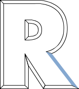
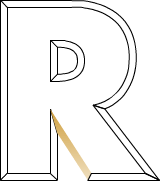
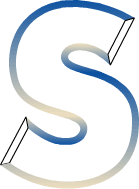
The bevels sometimes pose some interesting combinations of the reflections. Bevels that face down, will reflect more of the ground, while bevels facing up, reflect more of the sky. Curvy bevels will sometimes reflect both. The next part of this tutorial will show what kinds of fills to use when faced with different types of bevels.
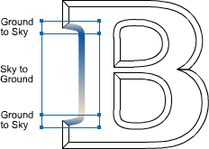
Vertical bevels will reflect both the sky and the ground. Use the Sky to Ground style.
Curves bevels that face outward will also reflect the sky and ground. Use the Sky to Ground style.
Inner facing curved bevels will reflect the sky and ground in reverse. Use the Ground to Sky style.
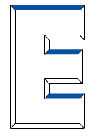
Bevels that face upwards will reflect a lighter sky. Fill with 50% Blue and no Stroke.
Downward facing bevels reflect a diffused ground. Use the Ground Grad style.
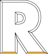
Downward facing horizontal bevels, reflect only the ground. Fill with 75% Ground and no Stroke.
Bevels that face upwards, reflect just the sky. Fill with Blue and no Stroke.
Other curved shapes and serifs
It gets more complicated with really curvy bevels and serifs that may be in your letters. Below are how to handle those.
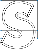
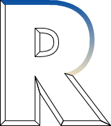
Draw two Rectangles over the top of the upper curved bevel. The seam of the rectangles should be about where the curve starts to go back upwards like shown above.
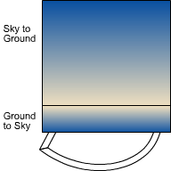
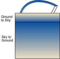
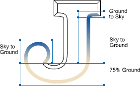
Fill the top rectangle with the Sky to Ground style and use Ground to Sky for the bottom rectangle. Lines for clarity only. Select both rectangles and Cut them. Then select the bevel and Paste Inside.
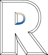
Repeat those steps very similarly for the lower bevel. Fill the top rectangle with Ground to Sky and the lower with Sky to Ground. Lines for clarity only. Select both rectangles and Cut them. Then select the bevel and Paste Inside.
Next, set the Strokes of the bevels to None. You should have two bevels that look like above. That is starting to look great!
Serifs can be pretty confusing, but if you think about what is reflected, it makes sense. Use a similar technique as before creating rectangles that cover the bevel. Make sure that the seams touch where the curves change direction. Use the fill styles as shown above.
Another daunting bevel type could be like the one shown above where the curves go all over the place. Using similar techniques as described before, create a new fill wherever the curve starts the change.
At this point, you may be asking yourself, "Why aren't we using the multicolored Gradient fills instead of all these paste insides?"
I thought about that too. This tutorial was originally written before the multicolored gradients were introduced, and I started playing with creating all these gradients instead of using paste insides.
The problem I started to see appear was when there were different letter shape bevels. Since each bevel shape has different needs, I found myself adjusting the placement of the colors in the Gradient palette in order to fit that particular shape. Using the rectangle paste insides gave me more accurate results as far as the placement in those extreme curve areas where the colors may shift. It was much easier to control the rectangle placement rather than adjusting the gradient colors. Not to mention that I would have needed to create a new style for every different gradient I was going to come across... not fun.
But of course, that's my preference. If you would like to experiment with creating multicolor gradients instead of using the rectangle paste insides, go for it. Now let's finish off the chrome effect.

Creating the reflection
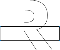
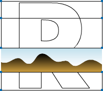
1) First hide the Bevel layer and make the Reflection layer visible. Draw a Rectangle across the top of the letter. If you have more than one letter, make it's width cover all of them.
The placement of the rectangle is completely up to you. This is where the horizon of the reflection will be.
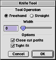
2) Bring up the Knife Tool dialog by double-clicking on the Knife Tool. Pick the FreeHand setting, with a width of 0. Also make sure that Close cut paths is turned on.
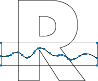
3) Keeping the rectangle selected, make a wavy cut across the entire width of the rectangle like shown above. You should now have two pieces to create the horizon area.
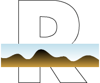
4) Fill the top piece with the Sky to White style. Use the Horizon style for the bottom piece.
5) Cover the rest of the letter (or letters) with three more rectangles so they touch, but not overlap like shown above.
6) Fill in the rectangles using the Styles and color shown. Lines for clarity only. Select all the parts and Cut them.
If the letter has knockouts like this one, then select those parts and Join them together.
Select the letter shape and Paste Inside. Give the letter a 1 point White stroke. Finally, reveal the Bevel layer and there you have a beautiful Chrome letter.
Well I hope you survived this tutorial. There were many things here that I hope you learned from it. These include using Styles to easily create similar fills as well as how to use Paste Insides to solve certain problems with Gradient fills covering really curvy shapes. Not to mention how to look at objects and understand how they work in real life such as how the chrome reflects things around it.
I know that when I first learned this technique, it helped me keep things organized on layers and naming colors to easily track down colors.
I highly recommend you experimenting with other shapes besides words. There are all kinds of things out there that may pose challenging circumstances. For instance, try to make a chrome object out of an odd symbol in any Dingbat font. Be warned however, that the more letters or objects you will be making into chrome, the longer it will take.

Twitter Delicious Facebook Digg Stumbleupon Favorites More

 
Powered by Blogger